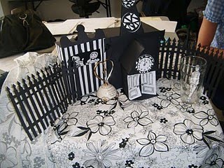
7 x 7: Elements we have created...


When i was on Facebook, i stumbled across one of my friends' modelling photo's which caught my attention and it reminded me of Alice in Wonderland! Also, i thought the little black and white house was similar to the paper models Gemma was in the process of making so i brought it to her attention. I also liked the black and white squared cloth she appeared to be lying on so we decided to find some material similar to this...


We thought it would be a cool idea to photograph him inside a pint glass instead of actually in the pub where he storms off to in a mood in the story..^

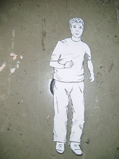


For our final idea, we've decided it would be nice to build our own mini village consisting of the main elements in the story...The church is going to be the main focus so Gemma will put her fab paper making skills into practice and make most of the models and i'm going to be designing and drawing the characters, similar to how they appear in Container Plus. We thought it would be good to make the village quite Gothic as the story holds quite a religious theme throughout and the idea of Gothic churches. Hopefully when it comes to photographing everything, we will be able to create a sense of mystery and atmosphere to the images. Here are some of our elements we've created...

Su Blackwell


Su Blackwell makes intricate art-works from every-day objects, transforming clothes and books into fantastical three-dimensional forms. Using a scalpel she cuts and glues the pages of books to create miniature dioramas glowing with lights in wood and glass boxes, like Victorian relics found in a museum of intrigue.

She finds her books by trawling through second-hand book shops. She always reads the book first and this in turn inspires the work. Some of the books that come into the artist’s possession sit on her shelf for months and months. The books themselves, their histories and stories, also interest her. I love how she makes the characters and different elements actually out of book pages so they still have the text written all over them...this one above was based on 'The Wizard of Oz'.

7 x 7: Container Plus... research and ideas


My particular favourite is the typewriter image where it looks as if all of the little drawings are coming to life and about to walk off the page. We thought about making all of our own elements and characters so they look as if they'e pouring out of the church one of the main elements in the story. I think an idea like this would be good for an animation and i've taken a screenshot of Su Blckwell's animation which i've previously looked at...^


Gemma suggested we look at some of Container Plus's work which i really liked when they came in to talk to us in college. I've never really thought of working this way before but with Gemma paper making skills combined with my love for drawing, this seemed like a really good idea. We decided to work together which we both thought would be a good idea after I think we were both a bit scared to suggest it to one another incase we thoguth the other didn't want to! :) We both had corresponding ideas of building our own paper set like Container Plus do, including real objects also and then photographing the models in the photographic studio.

7 x 7: Charm bracelet


We thought it would be a nice idea to make a huge over exaggerated charm bracelet to lie over the pregnant lady when she has collapsed on the ground (like the real life model lay down in the image above by Container Plus). We were thinking of making her out of white card and combine drawing and use other materials to make her look as if she is wearing a white floaty dress- kind of like a wedding dress as it is her dream to get married and have it draped out onto the floor along with her long dark hair. The charm bracelet would look as if it is protecting her and would include paper charms such as the pram, the crucifix and the heart which are also mentioned in the story. All of these models will be taken into the studio to be photographed and we shall also play with different colours and lighting effects.

7 x 7: Text and Image Brief

Below is a photograph of a pretty lantern which Gemma bought in because in Joanne's story, it refers to a 'magic lantern' so we thought it would be nice to experiment with light and he different coloured filters in the photographic studio to create the stain glass effect. I think the main subjects of the story are the church, the lantern and the idea of hope. I think this lantern is perfect as it already has a stain glass pattern around it which would look lovely when lit up with tea lights. We looked at a few images of churches and stain glass windows...


I'm really looking forward to the new brief we've been set, where we'll be working in pairs and collaborating with MMU students who are in their 3rd year studying English Literature. We've been asked to illustrate a 3000 word story which they've written which i'm really looking forward to as this is the sort of path i'd like to take in the future. The story i've been given is called ''When a door opens'' by Joanne Key, alongside Gemma Beavan and we can choose whether or not we would like to collaborate with one another. Gemma and I have worked together before where we had to produce a short animation which proved successful as we both have similar interests and ideas. I think it would benefit us both if we did work together as we could motivate each other and exchange our ideas. I think it's brilliant that we each have the chance to work alongside and i'm going to put 100% into this live project as it mans our illustrations will be shown at the 'English Literature Festival'. Later on in the third year, we will produce a 15 second animation which will also be shown at the festival.

Sailor tattoos!


I don't know why but sailor tattoos are just really cool. I like them because they're tacky and look funny on a butch man's arm...especially the sexy lady ones- i think i mainly like them for their outfits but also because it's how i like to draw...^ Some of Sailor Jerry's tattoo designs inspired me when i did the second part of my Fotografik brief... I did my own screen print of a sexy lady between the phrase "Hello Sailor" and then photoshopped it onto a photo of my brother's (not so muscly) arm.

Bodypainting/Fotografik/Water brief


Here are a few more body painted images i really like.. The one above inspired me to give the corset idea a try. I did a photo shoot with the photographer Sarah Golding and a lady called Lisa, the make-up artist who also painted the corset and when i saw it, i had no idea that she'd painted it, i thought she was wearing an actual corset! She said it took her 2 and a half hours in total to do.


Also, with my water project, i thought i'd continue to do a bit more body painting in my final piece as my main theme was 'dirty water and disease' so even though it's not the prettiest of subjects, i focused on Scabies and Leprosy and thought it would be interesting to paint this effect onto my mums arm and then photograph it whilst she's pretending to drink a glass of dirty water...basically showing what can happen.


Here are a few examples of when i painted a corset onto a friends back...I asked her to bend her body to capture the creases in the skin and how the painted lines move with the skin. I wanted to give body painting a go as part of the Fotografik brief just because I thought it would be something different to try and I could be experimental with the light and different poses. I enjoyed working this way as it was fun to do and something completely different to what i'd normally do. I simply used face paint and bought separate bits of material for the lace, ribbon and skirt.