My Artefact...


I was so so angry because my artefact never bothered to turn up on time which is typically my luck so as you have already probably seen, i created a mock up version out of clay just to show you what it was that should've been there. You'll recognise my trademark green bird which features on my business cards, website and originally was created for my Sinbad the Sailor projecr. As simple as it sounds, you can stick it virtually anywhere and i got the idea from one of those things you stick in a plant pot for decoration. It includes my details on the side and you could even stick it in a pen holder or empty mug on your desk. www.zapcreatives.co.uk said they would turn my design into 3D using a plastic laser cutter, similar to how they create 3D charms for bracelets. I was able to upload my deign after exchanging a few details via email and for 20 which i have ordered, it has cost me £25.99. I want to have a little pot of them when they arrive in time for my exhibition next to my work for the public to take as they please.

My edited final images


This again, is probably another one of my favourites along with my wolf/knife and fork image simply because it's one of the most abstract. I've named it 'The Kiss' because this is taken from my printed image of the Wolf and Little Red closely facing each other. I found it hard to transform my wolf into something more fierce rather than a bull terrior so added some teeth and cut out his eye just like i have for every wolf in each image. I was also going to keep the nice shape of Little Red which was originally surrounded by that curvy shape but again, it looked too much like a scene so to make it more interesting, i got rid of her and used the curvy shape to symbolise her womanly figure. I added to hearts to act as her assets and they also symbolise the theme of the image. The cross and arrow is a subtle touch to explain the physical attraction between them both.


This one is based on Little Red's journey to her grandmother's house. The cake is here simply because that is what she is taking to her. Instead of just throwing a few trees in here and there, i thought i'd fill the red silhouette with trees to make it look like the area of the forest. The arrow is directing her towards the house and the wobbly shape surrounding her symbolises the path. It's called 'The Journey to Grandma's house'.


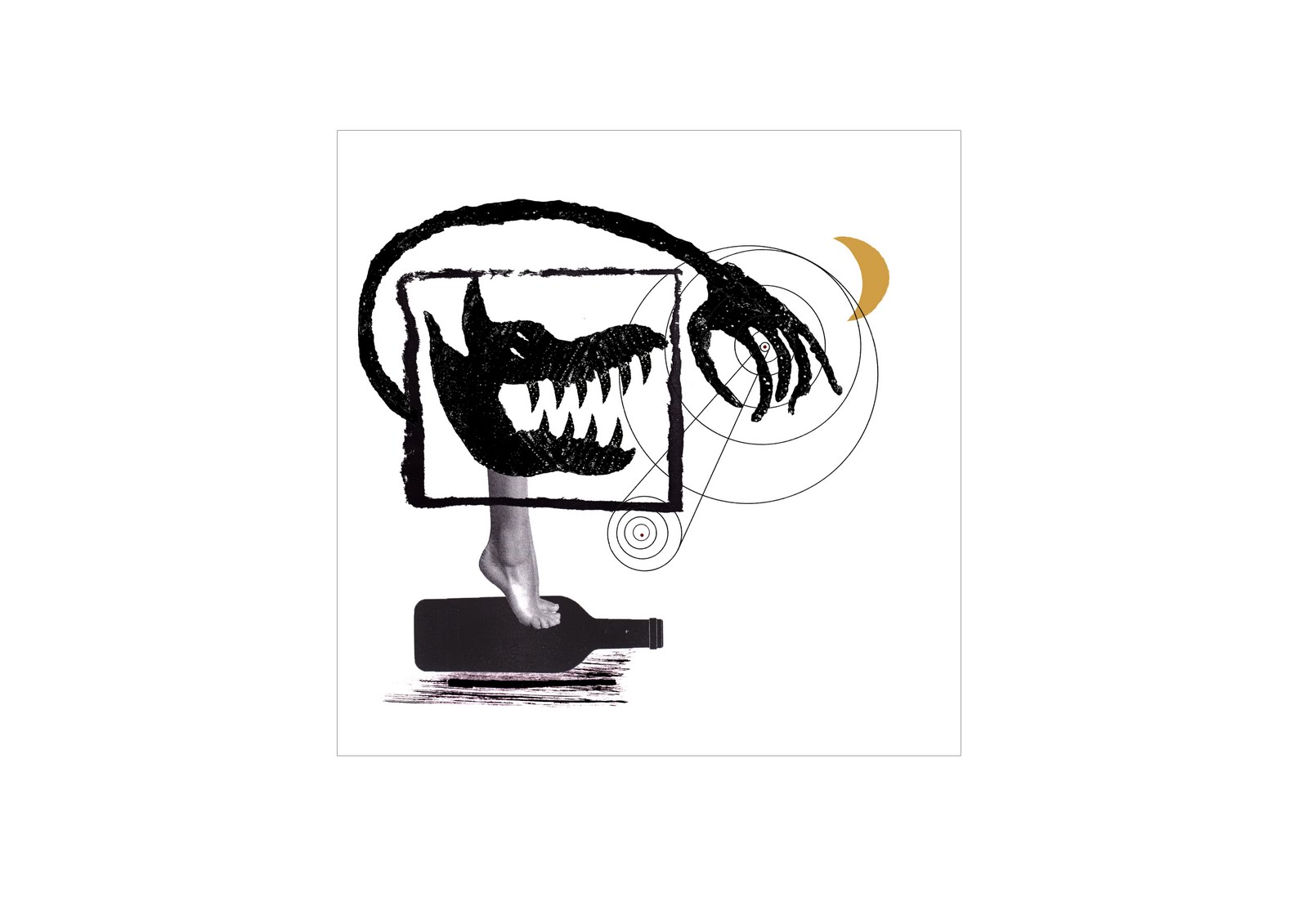
I've kept to the original idea and called this image 'Natural Cycles'. This was from one of the 4 titles i was going to base it on and i wanted to keep it because i liked the wolf i had already printed with his huge gangly arm. It needed adjusting quite a bit so made the arm reach out around the box a bit more and instead of using the original red printed sun, i swapped it for a more intellectual diagram of the solar system for contrast between line and print. My other sun looked a bit crude and clumsy but i still used the same idea. Really pleased how this one turned out, although i noticed o e thing i'd forgotten to do...make the bottle look 3D! I'll correct it in time for the exhibition.


A bit like the 'Evolution of Wolf', i created the 5 little red females for the same reason, to show age because this was to show 'ritual'. You probably will have seen my 5 original little reds already in a previous post but i've changed them quite a bit since then as they appeared to be a bit too cartoony. Instead, i tried to make them look more like the female sign on a toilet. I was really chuffed with how the stick and ink drawing of the big little red turned out, looking a bit saucier and sexier with age to show her less innocent side so i thought i'd add her for a bit of contrast. I've called it 'Evolution of Red'.


I call this image 'Operation'. It is linked to the 'Caesarean' image but i wanted to make it look a bit more clinical and set a bit of a scene- not too much though! we like abstract ;) again, this depicts when the wolf gets cut open but this time with a saw as if the grandmothers bedroom has been turned into an operating theatre.


Again, this image is related to one of my original interpretations of the story 'Sexual Awakening'. As you can see, the pattern on the butterflies wings depict a females reproductive system and the curvy shape sat on top of the feet actually turned out to look like an egg! I didn't intend for that to happen but once i added the yellow circle, it turned out that way which i'm quite glad about seen as eggs feature in this subject! I decided to keep this theme because of the relationship between little red and the wolf in the Grimms brothers version of the story.


This is one of my favourites. I like it because it's abstract with the upside down tree and the wolf having a knife and fork for legs. I added them to symbolise him eating little red and the tree to create a sense of place as the forest. i've named it 'Tea time'.


The title of this image is 'Death of Innocence'. I decided to keep it simple but this represents the death of little reds grandmother after she has been eaten by the wolf. I was going to add a pair of glasses to make it more obvious but wanted to keep it simple.


When i was originally sticking to the four themes, the 5 wolves i created represented 'Ritual'. This is basically showing the wolf evolve from an innocent dog like animal into a big nasty mean animal. Each time he grows, he gains an item of the grandmother's clothing. This would also show him getting older. Its titled 'Evolution of Wolf'.


This image is called 'Caesarean'. The wolf is being cut in half by the scissors in order to rescue little red and her grandmother. The woodcutter does this before stuffing rocks inside the wolf and then sewing him up.

My online portfolio

http://katyjonesillustrate.deviantart.com/gallery/?catpath=scraps


Please take a look at my online portfolio by clicking the above link ^

The start of something good...

I decided to create my own compositions by taking a leaf out of Joan Miro's book...I had great fun making them and just being a bit fun with it. I think the contrast between the flat black objects like the butterfly really work against the textured shapes and i've tried to keep it simple by only using a splash of red in each one. At the moment, they don't really have a specific meaning but since playing around on the photocopier, i just wanted to play around with the different elements just to see what works..


alt=""id="BLOGGER_PHOTO_ID_5607062827754368114" />

Hopes, fears and opportunities...

Progress...

I'm really pleased with how everything has turned out after my 3 years spent at Stockport College and I have learnt so much, not just about Illustration as a whole, but about myself aswell. Instead of giving up easily if something isn't quite going according to plan, i've learnt to keep trying because at the end of the day everyone has to start somewhere. I'd describe the last 3 years as a rollercoaster ride but it has definitely ended on a positive note which feels very rewarding. I'd like to think i'm moving closer towards being a practiced illustrator even though I still need to work even harder in order to get myself that dream job of becoming a successful illustrator...so it wont be ending here!
If i'm honest, my work suffered throughout second year because I just couldnt find an ongoing technique which I could stick to so I lost so much self confidence and was even contemplating giving up but refused to let these thoughts get the better of me. I've enjoyed every minute of third year and I think the fact that I had the opportunity of choosing my own project has helped. When I have a strong passion for something, I just makes me want to keep going and I have the drive to do well. I think i've also gained more of an understanding where my work is heading and what type of work I could possibly get commissioned for. Again, before the final major project, I thought my illustration style was based more towards children's books but now, judging by my most recent work, I think they look a lot more sophisticated even when I compare it to my Sinbad the Sailor work which I am also very proud of, so they could even be suitable for a more mature audience.
There is still obviously a lot of room for improvement and need to remember the famous 'less is more' theory which I completely agree with. Hopefully one day not too far in the distant future i'll be at a comfortable stage where I can make the right decisions which is really important because our tutors aren't going be around for much longer!

Fears...

This is the time of my life which i've been dreading since day one at Stockport College, being let loose in the big wide world with no fellow students or tutors to help me decide what works with what. I have relied on other people's opinions in order to help me achieve what I have today. Sometimes I find it hard to know what's right and what's wrong but as mentioned before, hopefully i'll get to that point when i'll just know. I'm hoping to rent out a studio in Stockport along with a couple of other illustrators from our pathway which will be good.

Since going to London, it gave me confidence I didn't think I even had. I didn't go for as longas everyone else due to financial issues but I think the scariest part of everything was actually getting in contact with Art directors incase they didn't get back to you or they just instantly rejected your work. But actually, it becomes quite addictive and it's exciting when you find a response in your inbox, especially when its a positive one. It pushes you to work even harder when someone encourages you as opposed to being constantly put down or told you're doing it wrong. If nobody sees your work, then what's the point in creating it? Well, if your wanting to make money out of it that is. I didn't feel so confident about my portfolio when I went to London but I still put my work out there so i'd like to hope that people's thoughts and opinions would be even more positive, if it fulfils their expectations.

Opportunities...

I've really enjoyed my time at Stockport College and i'm very thankful for all of the prospects i've been given for the future. I'm definitely glad I attended this college over any other university as being in a fairly small group has been great when it's come to seeking help and advice off the tutors. I have been given a lot of guidance and confidence to visit different commissioning illustrators so i'm going to keep up the motivation and look forward to seeing what other opportunities are out there for me.

My Evaluation...

Well, what can I say...I think i've finally found the light at the end of the tunnel. It's only now that i've created 12 pieces of work and can honestly say i'm very proud of each and every one of them. I feel like my style has blossomed and turned into something which appears to show a higher level of sophistication and generally look more professional in comparison to a lot of my previous work. I just wish I could've found this style which has started to suit me much sooner because it would've given me a hell of a lot more confidence in myself and my work. Therefore, other previous briefs would have proved more successful. My final major project idea changed from the word go. I realise now that I spent too much time focusing on the end product and how I was going to execute it, rather than just going with the flow and seeing where the different processes and techniques would take me. I felt restricted with the idea of creating huge wall images and it was only half way through that I realised things wouldn't be as easy as I originally thought. I intended to create huge versions of my prints so I spent a lot of time researching how I could make this possible. Wall stickers was an idea but realised it wouldn't be possible as 1. it proved to be too expensive (at least over £40 just for one and I needed 12!) and 2. because all of my prints have a textured look to them, a guy from a company called 'Wall Tattoo' explained that my designs would have to be flat vector shapes of colour if I wanted them made as a sticker. This was because the vinyl cutter would simply break if it attempted to cut out each tiny dot of texture. I was introduced to a few of Joan Miro's masterpieces which were full of crazy shapes, lines and spots of colour every here and there and I immediately took a liking to them. I'd created elements from the story I.e wine bottle, flower, trees etc.. using the gum arabic printing process and as I already had my main collagraph images to depict the story, I somehow needed to combine them without it looking like id just thrown them together. This is when my whole project began to change from huge wall images into small contemporary mature Miro/Kandinsky style compositions. It took a few goes to get them looking right but I really enjoyed the challenge of making each image look abstract and tell a part of the story at the same time. I combined real life objects, textures, collagraph prints, lines and colour to create 12 exciting images. I was also going to have 12 so I would have 3 for each of the 4 original titles: sexual awakening, ritual, rebirth and natural cycles but decided not to stick to these. I have still kept most of the collagraph prints that relate to these headings in my new illustrations. All in all, i'm really pleased with how everything turned out and it has even improved my portfolio by miles..in my opinion anyway! I generally feel a lot more confident when showing my work to friends, family and art directors now instead of feeling like an amateur.

Joan Miro...

Here are just a few of Miro's work i looked at whilst trying to put my elements and main collagraph images altogether. I like how he keeps the colour palette simple and even though to some people it might just look like a simple colourful image, there's always a story behind each one. He proves that 'less is more' and this is the approach i want to take. Some elements can be unnecessary and your image may only need 2 elements in order to tell the story. This is what i need to remember.

"The spectacle of the sky overwhelms me. I'm overwhelmed when I see, in an immense sky, the crescent of the moon, or the sun. There, in my pictures, tiny forms in huge empty spaces. Empty spaces, empty horizons, empty plains - everything which is bare has always greatly impressed me." Joan MirĂ³,


10 more clients to add to the list...

Harper Colins
77-85 Fulham Palace Road
Hammersmith
London
W6 8JB
www.hapercolins.co.uk
contact: Julian Humphries, art director
020 8741 7070


AA Publishing
Fanum House
Basingstoke
RG21 4EA
david.watchus@theaa.com
contact: David Watchus, editor
01256 491 505


Black Swan
61-63 Uxbridge Road
Ealing
London W5 5Sa
www.booksattransworld.co.uk
contact: Claire Ward, art and design director
020 8579 2652


Doubleday
61-63 Uxbridge Road
Ealing
London W5 5SA
www.booksattransworld.co.uk
contact: Claire Ward, art and design director
020 8579 2652


Hemming Group
32 Vauxhall Bridge Road
London SW1V 2SS
www.tecmagazine.co.uk
contact: Emilie Francis, art director
020 7973 6400/4684 (direct)


Little Brown Books
100 Victoria Embankment
London EC4Y ODY
duncan.spilling@littlebrown.co.uk
contact: Duncan Spilling, creative Director
020 7911 8000


Manning Partnership
6 The Old Dairy
Melcome Road
Bath BA2 3LR
garry@manning-partnership.co.uk
contact: Garry Manning, managing director
01225 478 444


The Friday Project
77-85 Fulham Palace Road
London W6 8JB
corinna.harrod@harpercolins.co.uk
contact: Corinna Harrod, editor
020 8741 7070


Weidenfield
Orion house
5 Upper St Martins Lane
London WC2H 9EA
lucie.stericker@orionbooks.co.uk
contact: Lucie Stericker, creative director
0107240 3444


Crown House
Crown Buildings
Bancyfelin
Carmarthen SA33 5ND
tfitton@crownhouse.co.uk
contact: Thomas Fitton, designer
01267 211 345

My short and sweet visit to London

My visit to London was rather short and sweet sadly due to financial issues so couldn't stay for the whole 3 days but I still found it very rewarding and ended up coming back to Manchester with bags more confidence. I wasn't completely 100% satisfied with my portfolio at the time but I didn't want to let it stop me from going so I bit the bullet and got myself out there. I wish i'd gone with a more substantial set of work like I feel I have now because I think I would've found it much easier to talk about my work and come across as more confident. I arranged a visit with Harper Colins, who were extremely friendly and even though it was rather brief, I felt like i'd achieved something. I spoke to Julian Humphries, the Art Director and he took a liking to my Sinbad the Sailor work. He said it takes a lot of courage for students to come in and sit down and talk about their work, plus it's impressive when someone goes and makes that extra bit of effort to research the company first by finding out names which adds a more personal approach. We didn't discuss my work in too much detail, it was mainly about the Illustrating industry as a whole and I asked him about the sort of things like how do they prefer to view somebody's work. They said they preferred to view a clear, neat online PDF portfolio so they can cut straight to the person's work instead of receiving hoards of parcels of work in the post which I can understand. It comes across as being more professional if the person has their own website and is easy to find online. At the end of the day, they want to be able to quickly flick through the illustrators work, cut to the chase and see if they are capable of producing the work for a specific brief.

As mentioned before, it has only really been in the past month that I've felt tonnes more confident about my work so I have sent my online portfolio to a number of companies, most of them on my client list so i'm awaiting replies. I will post feedback on here once received.

wolf and little red

I stumbled across Pablo Picasso's 'The Kiss', and i personally think the male figure is being rather forceful. I thought it could fit into the 'sexual awakening' heading that i'm creating 3 different images for so i made my own collagraph version of the wolf and little red riding hood. I wanted to show the sexual attraction between the 2 characters as they share a very different relationship with one another in the Grimms fairytale version.


The cloaks hung up

This is a collagraph image which i printed to represent 'Ritual'. I've though of it as being an ongoing cycle with Little Red constantly going back to Grandma's house....even though she knows it's the wolf that's actually in her grandma's bed. I know it is a bit weird this whole dark side of the story but this is why i find it interesting. The red coat symbolises that she is currently at the house and nothing has happend to her yet whereas the following black coats symbolise death and that she has already been swallowed up. I've repeated the coat just because it is simply a repeat of her going back there.

Jockum Nordstrum

Jo actually introduced me to Nordstrum's work when i was wondering how to combine my main story images with the story elements. They set a scene without looking like a scene at the theatre if that makes sense? I like how its pretty surreal with certain people's missing body parts which add a bit of humour to the image.


final wolf with colour

The Big Bad Wolf...

I've started to think about how i'm going to present all of my illustrations and i had the idea of having them printed as really large wall stickers. I was going to just have them printed off onto normal paper at A2/1 size and spray mount them onto my boards but i thought it might be a bit risky and it could look a bit messy and unprofessional. I emailed a guy called Danny from a company called Wall Tattoo. I enquired to see if it would be possible to eventually have my 12 images printed onto adhesive paper but apparently it's not as easy as it sounds! Here was his response to my query although i can't seem to find that so sorry!...he was very friendly and helpful though!


On 11 Apr 2011, at 18:44, "Mr Wall Tattoo" wrote:

Hi Katy/Kaytee/Kayttttttttttttteeeeeeeeeeeeeeeeeeeee

Trust all is well in the designer/uni world and you are revving yourself up for some major style workload leading upto your exam!?

Thanks for your comments about the site, appreciate it.

I can try and help, but because I'm from up North I'm slightly mad and don't quiet get what you think we can help with!! Sorry, its me honestly, not you.

Collographing, what exactly is that? Are you designs finished pieces of art then? How would you see us helping you put them on the wall without us using vinyl?

The two services we offer are:

Solid colour vinyl , such as the designs on the site, generally one colour and silhouette.

Images printed onto white vinyl (Basically using the vinyl as printing paper) these can then be applied to walls directly

Let me know what you were thinking, we often create peoples designs into Wall Tattoos, and have worked with Students before on this...but this was very much digital illustrators who hand us a vector file and we give it a Wall Tattoo makeover!

Lemme know,

D

my response:


On 11/04/2011 19:35, Katy Jones wrote:


Ha don't worry, it's probably Coz I'm not too great at explaining things :-/ it's just that I spoke to a technician at uni and Coz she said my images aren't just silhouettes of solid colour so a vinyl cutter wouldn't be able to do it?

I could send you an example if you want as a jpeg file Coz then it'll be easier for you to see if your able to do it or not but it's totally cool if you can't.

My projects all about the dark side of fairytales and I'm looking at little red riding hood so you might think my image is a little crazy but it does have a hidden meaning!

Thanks,

Katy


Danny's response:

In this case then maybe I can help! Most of the WT "Stock" designs are solid vinyl, silhouette...but we do have an uber cool vinyl cutter which prints any image onto blank vinyl first and then just cuts round the outline of the image. Not sure if this makes sense?!

Basically, say you printed the below onto plain A4 paper...then you would have to tape or pritt stick (Does anyone use them anymore!!) onto the wall.....Well our machine prints onto huge sheets of vinyl, which obviously is adhesive so the image basically turns into a big sticker which can be easily wall mounted!

Send me the JPEG if you could for better inspection...obviously the only thing we can't do is add texture, it would just be a smoooooottthhh surface? Is that ok

Bless ya Katy

D

p.s. I actually love your idea....I bet most fairytales have a seedy darkside don't they?


Peace,

Danny Martin

Mr Wall Tattoo

My response:

That would have been great but the only thing is, I need the patterned textured details on the images Coz this is the technique I've used throughout. But thankyou so much for your help and advice!

I may actually have a few black solid silhouette shapes which could need printing so once I've figured out the size I'm gonna need them il send you over an email!

Thanks

Katy

Danny's response:

Aww sorry then chuck, texture I can't do!

Good luck with stuff, and hit me back if you do need some silhouettey style ones I can help with.

Thanks for following us on Twitter...I actually have not one bit of a clue how to use it but a mate said to me "Oh man, you haven't got twitter....I just, well, can't believe it" Like I just stood on his cat. I thought he was going to cry so relented. Two months later I still have no idea....

ahhhh,

Peace,

Danny Martin


Sun and tree...Natural cycle theme


Evolution of the wolf...

Adding a splash of red...

Gary Goodman


Gary Goodman's work is not pretty. It is direct, confronting, un-self-consciousness, un-polite. But there is something about it that I find full of intrigue. He knows, lives and breathes his subject inside out. 'Style' goes out of the window and having something to say is of greater importance. His paintings often include a female figure, in the woods , in some kind of encounter - what is the narrative?